
5 Key Dashboards
Click Dashboard in the blue bar at the top to see the following dashboards…
Staff Loading
Financial Summary
Staff Performance
Distributions across LAC, LGA, SC, PM etc
Status Change trend dashboard
eTrack dashboards are in real time and reflect the current data when run.
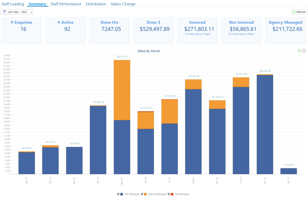
Financial Summary
The top boxes show the total number of Enquiries and Active Participants (ignoring date range).
The Done$, Invoiced$, Not Invoiced$ and Agency Managed$ for the selected date range.
Notes…
The values include the $’s for both time and expenses such as KM.
The # Enquiries and # Active work off the Audit Trail and are a count of how many there were in the selected date range (not double counted:-)
Invoiced and Not Invoiced exclude Agency/NDIS Managed Plans.
Agency Managed includes ALL time and expenses booked (whether Uploaded or not). However, very soon eTrack will track which time has been Uploaded to the NDIS portal.
So…Done $ = Invoiced $ + Not Invoiced $ + Agency Managed
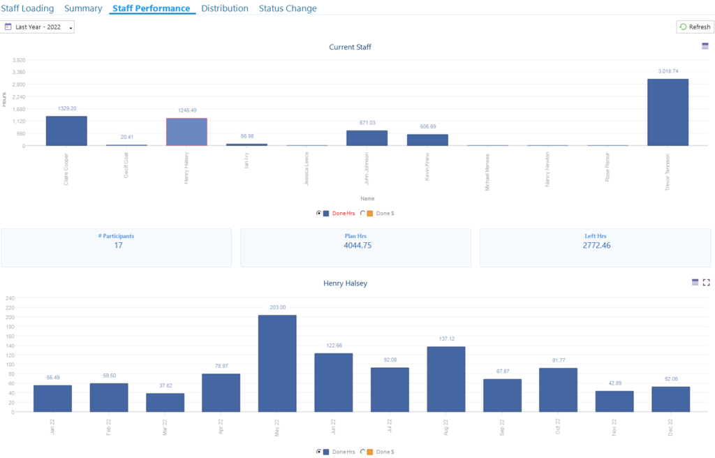
Staff Performance
The chart at the top shows the total hours or $ booked by each staff member within the selected date range.
Under that a chart shows a monthly breakdown for the specific staff member selected in the top chart.
Hint: Click on a Staff member’s bar (not their name) in the top chart to populate the bottom chart.
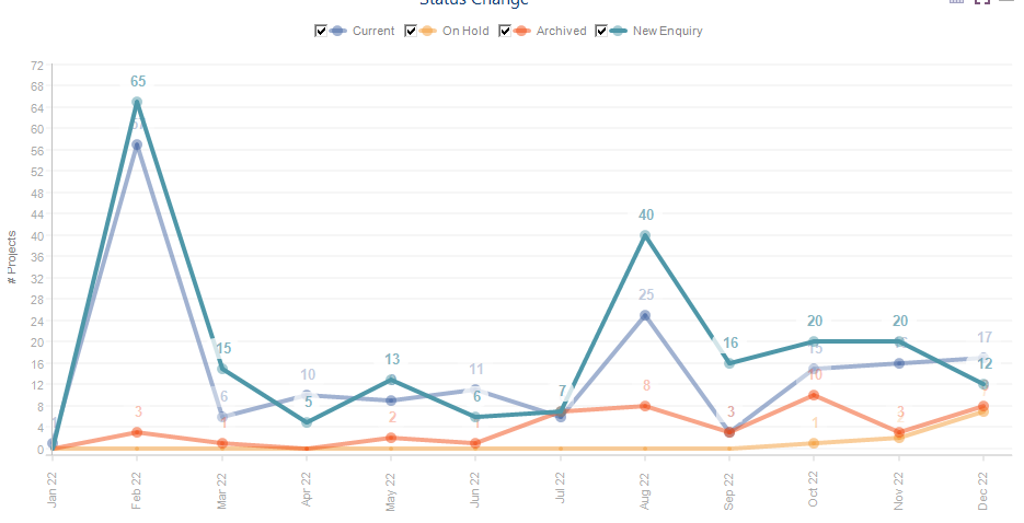
Status Change
This is a trend report that shows you a count of how many Participants have changed to each Status in each month using the Audit trail.
It shows your business activity by including ALL status changes. If for example a Participant is a New Enquiry and then changed to Active in the same month, they will appear in both ‘New Enquiry’ and ‘Active’ counts. The total of the values in any month may well exceed the total Participants you have.
For example, the following chart shows that in May 2022 there were 10 new Enquiries (green), 12 Onboards where status changed to Active/Current (blue), 4 whose status had changed to Archived (red) and 13 had their status changed to On Hold (orange).
Untick checkboxes to see a clearer trend of a specific status change.
To see a count of Participants with each status please view the Distribution dashboard pie chart and select the required date range.
Distributions
Use the Distributions dashboard to see who your most popular Plan Manager is, which LAG or LAC is providing the most Participants, the work distribution between Managers or a breakdown by Funding Method or Support Category.
If hard to read, Click ![]() to view any chart as full screen
to view any chart as full screen
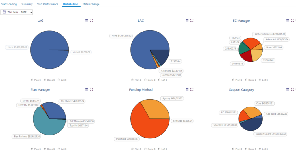
The Pie charts default to a COUNT of how many Participants. You can select the Plan $, Done $ and Left $ using the key checkboxes.
Important Note. Count, Plan $ and Left $ all ignore the date selector as not relevant. The date selector only effects Done $ including only the time and expenses booked within the selected dates.
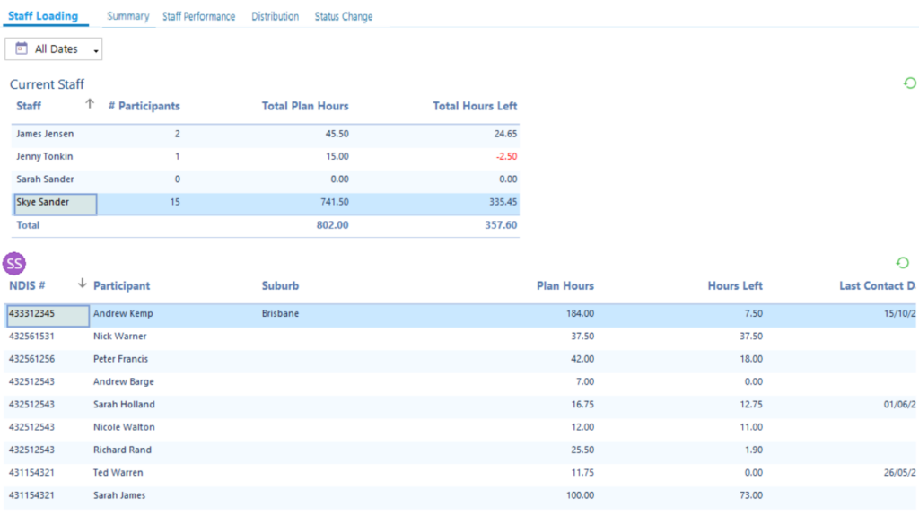
Staff Loading
This hasn’t changed but included here for completeness. It helps you determine how many Participants each staff member is looking after and the hours planned and available.
Click on a staff member in the top table to see their details underneath.
The ‘Last Contacted Date’ scours the database to see when was the last time a case note was created, or time booked, or an email was sent… very useful to ensure you stay in timely contact with everyone.
Hints
- To show more of the dashboard horizontally click << in bottom right of the navigation panel to collapse the left hand navigation tree. Click >> to re-expand.
- Use the icon
 to change to a table of values and toggle back to a chart using
 .
. - Click
 to view any chart as full screen. Click
 to collapse it again.
 - To refresh all data in the dashboard at once click the
 button top right.